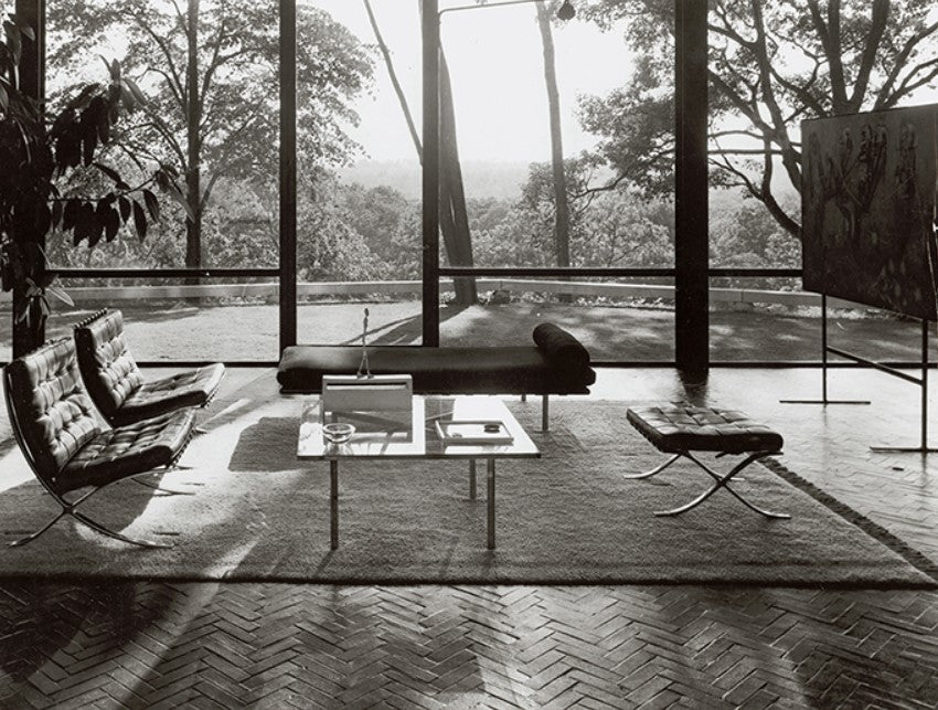
Ever since the modernist movement in architecture and design disseminated a new aesthetic across the cultural landscape of domestic and public interiors, the axiom “Less is More” has taken hold as a guiding principle of modernity, often attributed to the noteworthy architect and designer Ludwig Mies van der Rohe, whose clean geometries and structured simplicity arrested audiences in the mid-20th century and remains to this day a beacon for timeless beauty and purity of function. Though he may have been the first recorded to have said it, the belief that less is indeed more percolated throughout conversations of design since the Arts and Crafts movement, where excessive ornamentation was deemed banal and improper to delightful function, and found its way through Bauhaus, a revolutionary art and design school in Germany, where Walter Gropius affirmed that functionality should dictate form and paved the way for a minimalist style of architecture, replete with cubist design, flat roofs, and expanses of glass. Likewise, many product designers like Dieter Rams, Richard Sapper, and Massimo Vignelli unearthed a rare beauty in simple forms that not only made objects more intuitive and easy to use, but offered a serenity and ecstasy in work that was pared down to its essentials, a visual calm that is both alluring and enchanting.
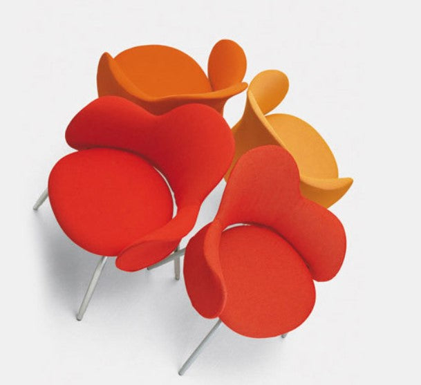
Yet while a clean, unassuming grace inspires some with poetic visions of tranquility and exquisite appeal, not all agree that “Less is More.” Perhaps in reaction to some of the bare aesthetics and rational ideology of the Modernist movement, some designers and architects took a more maximalist approach, aiming for design and architecture that was more robust and warm, peppered with humor and personality, in attempt to write an urban landscape that was more sensitive to context and did not abide by the rules of the earlier modernist manifestos. One of these voices was American architect and intellectual Robert Venturi, who in a moment of defiance and aplomb exclaimed, “Less is a Bore.” For Venturi, he found elements more interesting when they were hybrid, and not pure, favoring the compromising and the distorted over the clear and straightforward. This taste for messy vitality over obvious unity can be seen in buildings like the Children’s Museum in Houston, Texas, where bold colors stand out along chunky columns, or in furniture design, as with the Queen Anne Chair for Knoll, whose busy patterns and playful form offered a new take on old styles, asserting that decoration is in fact part of the communication.
While the complexity and contradictions of work that emerged from Venturi’s Postmodern movement granted a variety of pieces replete with excesses in color and embellishments, some playful and thought-provoking like the brave and at times chaotic pieces from the Memphis design group, or controversial though expressive like the Portland building by Michael Graves, the charioteers of maximalism did not overthrow the admirers of the minimalist aesthetic, but have rather nestled alongside them, in dialogue with one another to uncover designs that speak to one’s emotions and harmonize seamlessly with the needs and desires of a public at any given time, some drawn to the richness of character and others seduced by the sleek sophistication of simplicity. Is less more? Or is less a bore? Both can be true, and no single mantra can dictate what enlivens our souls to the affluence of visual joy and delight in use, whether streamlined and refined, or bursting with unbridled anarchy of form.
April 2024


